Home Assistant Dashboard Setup: The Complete 2026 Guide
Master Home Assistant dashboards in 2026 with this comprehensive guide covering mobile-first design, custom cards, and best practices for a beautiful smart home control center.
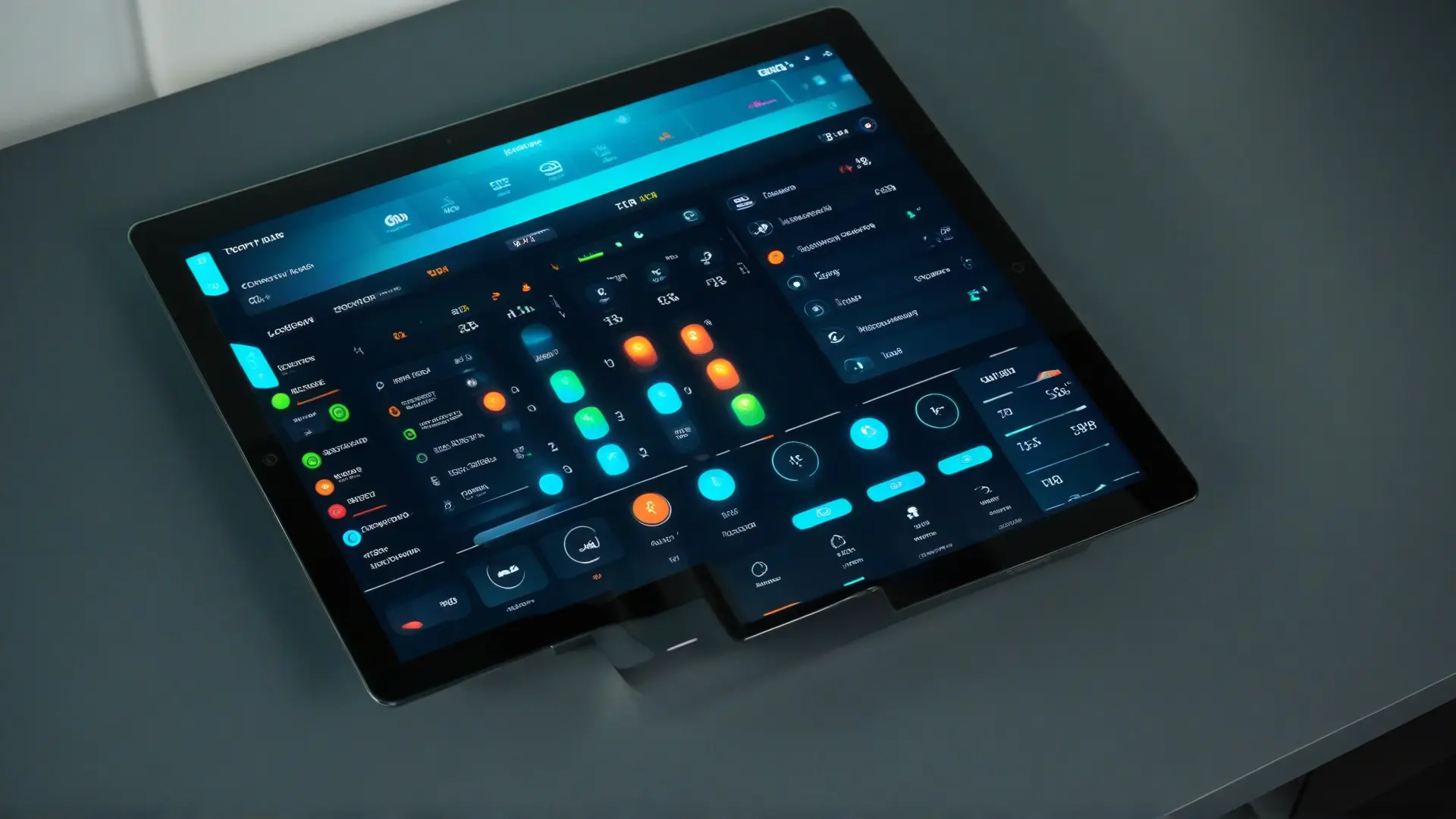
Table of Contents
- The 2026 Dashboard Philosophy
- Planning Your Dashboard
- The View Structure
- Organising by Function vs Location
- Essential Custom Cards (via HACS)
- Installation via HACS
- Must-Have Cards for 2026
- Building the Home View
- Step 1: Weather and Presence
- Step 2: Quick Scenes
- Step 3: Security at a Glance
- Creating Room Views
- Living Room Example
- Advanced: Conditional Cards
- Dashboard Display Options
- Tablet Wall Mount
- Browser Mod for Device-Specific Views
- Design Tips for Beautiful Dashboards
- Color Consistency
- Button Card Styling
- Performance: Don’t Overdo It
- Mobile Dashboard Best Practices
- Example: Complete Home View YAML
- Dashboard Checklist
- Final Thoughts
Your smart home is only as good as your ability to control it. A well-designed Home Assistant dashboard transforms a collection of devices into a coherent, usable system. In 2026, with Home Assistant’s refreshed mobile experience and powerful custom cards, building an exceptional dashboard has never been more accessible.
This guide covers everything you need to create dashboards that are functional, beautiful, and tailored to your life.
The 2026 Dashboard Philosophy
Home Assistant 2026.1 introduced a significant shift: mobile-first design with summary cards. The new approach prioritises:
- Less clutter, more vibes: Show only what matters
- Responsive design: Works on phones, tablets, and walls
- Summary cards: Key info at a glance, no extra taps
- Custom theming: Dark mode by default, consistent styling
💡 Design Principle: A dashboard should answer questions before you ask them. “How warm is it?” should be visible without opening anything.
Planning Your Dashboard
Before touching the UI, plan your information architecture:
The View Structure
┌─────────────────────────────────────┐
│           HOME VIEW                 │
│  Summary of everything important    │
│  - Weather, presence, alerts        │
│  - Quick scene buttons              │
│  - Lock/garage status               │
├─────────────────────────────────────┤
│          ROOM VIEWS                 │
│  Living Room, Bedroom, Kitchen...   │
│  - Room-specific controls           │
│  - Lights, media, sensors           │
├─────────────────────────────────────┤
│         MEDIA VIEW                  │
│  Music, TV, speakers                │
│  - Now playing                      │
│  - Volume controls                  │
│  - Source selection                 │
├─────────────────────────────────────┤
│         SYSTEM VIEW                 │
│  Server health, automations         │
│  - CPU, memory, disk                │
│  - Battery levels                   │
│  - Automation status                │
└─────────────────────────────────────┘
Organising by Function vs Location
| By Location | By Function |
|---|---|
| ✅ Natural for households | ✅ Better for power users |
| ✅ Each family member finds their room | ✅ Task-focused |
| ✅ Logical for guests | ✅ Fewer views to maintain |
| ❌ Redundant controls across rooms | ❌ Requires mental map |
Recommendation: Use hybrid approach—Home view for quick access, Room views for details.
Essential Custom Cards (via HACS)
Home Assistant’s default cards are good. Custom cards make them great.
Installation via HACS
- Open HACS → Frontend
- Explore & Download repositories
- Restart Home Assistant
- Clear browser cache
Must-Have Cards for 2026
# Install these via HACS
hacs:
  - mushroom  # Clean, modern cards
  - button-card  # Highly customizable buttons
  - mini-graph-card  # Beautiful charts
  - layout-card  # Better layouts
  - browser_mod  # Per-device dashboards
  - lovelace-auto-entities  # Dynamic lists
Building the Home View
Step 1: Weather and Presence
type: horizontal-stack
cards:
  - type: custom:mushroom-weather-card
    entity: weather.home
    show_conditions: true
  - type: custom:mushroom-person-card
    entity: person.anthony
    layout: vertical
Step 2: Quick Scenes
type: grid
cards:
  - type: custom:button-card
    entity: scene.movie_night
    name: Movie
    icon: mdi:movie
    tap_action:
      action: call-service
      service: scene.turn_on
    styles:
      card:
        - background-color: var(--primary-color)
  - type: custom:button-card
    entity: scene.goodnight
    name: Night
    icon: mdi:bed
  - type: custom:button-card
    entity: scene.good_morning
    name: Morning
    icon: mdi:weather-sunny
Step 3: Security at a Glance
type: horizontal-stack
cards:
  - type: custom:mushroom-entity-card
    entity: lock.front_door
    name: Front Door
    icon_color: >-
      {{ 'red' if is_state('lock.front_door', 'unlocked') else 'green' }}
  - type: custom:mushroom-entity-card
    entity: cover.garage
    name: Garage
Creating Room Views
Living Room Example
type: vertical-stack
cards:
  # Lights
  - type: custom:mushroom-light-card
    entity: light.living_room
    show_brightness_control: true
    show_color_temp_control: true

  # Media
  - type: custom:mini-media-player
    entity: media_player.living_room_tv
    artwork: cover

  # Sensors
  - type: horizontal-stack
    cards:
      - type: custom:mushroom-entity-card
        entity: sensor.living_room_temperature
      - type: custom:mushroom-entity-card
        entity: sensor.living_room_humidity
Advanced: Conditional Cards
Show different content based on conditions:
type: conditional
conditions:
  - entity: input_boolean.guest_mode
    state: 'on'
card:
  type: custom:mushroom-title-card
  title: Guest Mode Active
  subtitle: Automations paused
Dashboard Display Options
Tablet Wall Mount
The most popular 2026 choice:
| Tablet | Size | Price | Notes |
|---|---|---|---|
| Fire HD 10 | 10” | $99 | Fully Kiosk Browser recommended |
| Samsung Tab A8 | 10” | $199 | Great screen, Goodlock for kiosk mode |
| iPad 9th Gen | 10” | $329 | Premium, but expensive for wall mount |
Browser Mod for Device-Specific Views
# Different dashboards for different devices
browser_mod:
  devices:
    kitchen_tablet:
      device_id: kitchen_display
      dashboard: lovelace
      view: kitchen
Design Tips for Beautiful Dashboards
Color Consistency
# Use CSS variables in your theme
theme:
  primary-color: '#6366f1'
  accent-color: '#22d3ee'
  card-background-color: '#1e1e2e'
  primary-background-color: '#11111b'
Button Card Styling
type: custom:button-card
entity: light.living_room
styles:
  card:
    - border-radius: 20px
    - background: >-
        {{ 'linear-gradient(135deg, #6366f1, #22d3ee)'
           if is_state('light.living_room', 'on')
           else 'var(--card-background-color)' }}
  icon:
    - color: white
    - width: 30px
Performance: Don’t Overdo It
- Limit cards per view: 20-30 max
- Use conditional cards: Hide what’s not needed
- Avoid auto-refreshing graphs: They’re resource-intensive
- Test on slowest device: Your dashboard should work on old phones
Mobile Dashboard Best Practices
The 2026 refresh prioritises mobile:
- Large tap targets: Minimum 48x48 pixels
- Swipe navigation: Use swipe-card for carousels
- Bottom-heavy layout: Put controls near your thumb
- Quick access: Most-used actions in top 25% of screen
# Mobile-optimised layout
type: custom:layout-card
layout_type: custom:grid-layout
layout:
  margin: 0
  padding: 10px
  grid-template-columns: 1fr 1fr
  grid-template-rows: auto
cards:
  # Cards automatically arrange in 2-column grid
Example: Complete Home View YAML
type: vertical-stack
cards:
  # Header
  - type: custom:mushroom-title-card
    title: Home
    subtitle: >-
      {{ states('sensor.temperature_outside') }}°F •
      {{ states('sensor.precipitation_probability') }}% rain

  # Main controls
  - type: grid
    columns: 3
    cards:
      - type: custom:mushroom-light-card
        entity: light.all_lights
        name: All Lights
        icon: mdi:lightbulb-group
      - type: custom:mushroom-lock-card
        entity: lock.all_locks
        name: Locks
        icon: mdi:lock
      - type: custom:mushroom-cover-card
        entity: cover.garage_door
        name: Garage

  # Security
  - type: conditional
    conditions:
      - entity: alarm_control_panel.home
        state_not: disarmed
    card:
      type: custom:mushroom-alarm-control-panel-card
      entity: alarm_control_panel.home
      states:
        - armed_home
        - armed_away

  # Quick rooms
  - type: horizontal-stack
    cards:
      - type: custom:button-card
        name: Living
        icon: mdi:sofa
        tap_action:
          action: navigate
          navigation_path: /lovelace/living-room
      - type: custom:button-card
        name: Bedroom
        icon: mdi:bed
        tap_action:
          action: navigate
          navigation_path: /lovelace/bedroom
      - type: custom:button-card
        name: Kitchen
        icon: mdi:stove
        tap_action:
          action: navigate
          navigation_path: /lovelace/kitchen
Dashboard Checklist
Before considering your dashboard complete:
- All critical controls accessible within 2 taps
- Important states visible without interaction
- Mobile view tested on actual phone
- Dark mode works well
- Consistent iconography and colours
- No broken entities (check after restarts)
- Performance is acceptable on slowest device
Final Thoughts
The best dashboard is the one you actually use. Start simple—a few cards that control what you touch daily. Add complexity only when you have a real need.
Remember: every card you add is a decision the user has to make. Fewer choices, faster interactions.
Build for the device you use most. Optimise for the actions you perform most often. Everything else is noise.

Comments
Powered by GitHub Discussions